Victoria’s Secret Website Design
Elevating digital product storytelling to increase engagement and conversion.
-
E-commerce Experience Design
Product Storytelling
Editorial Layout Systems
Conversion Optimization
Visual Direction
-
VS Creative Team & Art Director
-
Photoshop
— Overview
Victoria’s Secret is a global lingerie and apparel brand known for its strong visual identity and influential presence in fashion and retail.
I partnered with Victoria’s Secret’s creative team to modernize product pages, bringing a more editorial, visually immersive approach to how collections are presented and explored.
— Challenge
Victoria’s Secret had strong brand equity, but its digital experience wasn’t fully translating the emotion and movement of the product in a way that encouraged exploration or purchase.
There was an opportunity to:
Bring the energy of the brand into the digital experience
Make products feel more desirable, styled, and contextualized
Improve engagement and ultimately drive conversion
— Solution
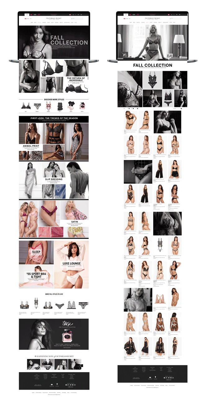
We reimagined product storytelling through a more editorial, content-driven approach, blending campaign imagery with product layouts to create a seamless experience between inspiration and shopping.The focus: Make browsing feel less like “shopping”, more like discovering a collection.

— Ideation & Design
I approached the experience through a story-first lens, treating each product category as part of a larger visual narrative rather than isolated items.
The goal was to:
Guide users through collections naturally
Create rhythm through layout, imagery, and spacing
Reduce friction between inspiration and action
— Research & Insights
Key observations:
Users engage more when products are shown in context, not isolation
Strong visual storytelling increases time on page and interaction
Traditional grid layouts limit emotional connection
This informed a shift toward editorial layouts + dynamic composition.— Design Explorations
We explored layouts that:
Layered product with campaign imagery
Introduced movement through varied grid structures
Balanced black-and-white visuals with selective color moments
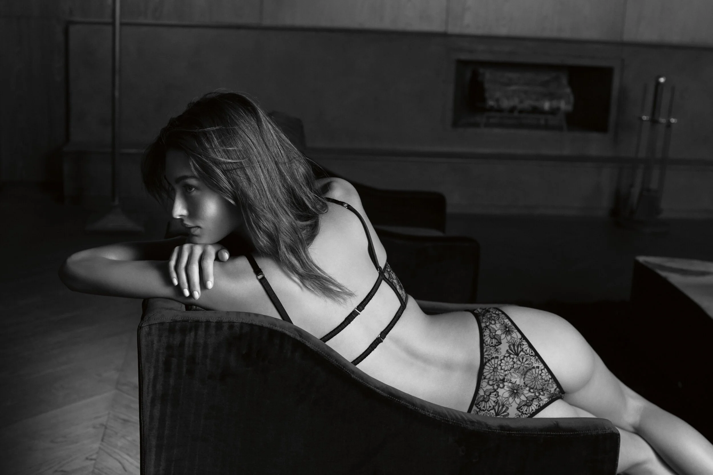
The black-and-white direction helped:
Create a more elevated, timeless aesthetic
Emphasize form, texture, and silhouette
Bring consistency across collections


— Execution
Solutions that stuck:
Modular editorial layouts combining product + lifestyle imagery
Dynamic grids that create visual flow and hierarchy
Integrated storytelling sections within product pages
Clear CTAs that align with natural browsing behavior
The result was a more immersive, scroll-driven experience that guides users instead of overwhelming them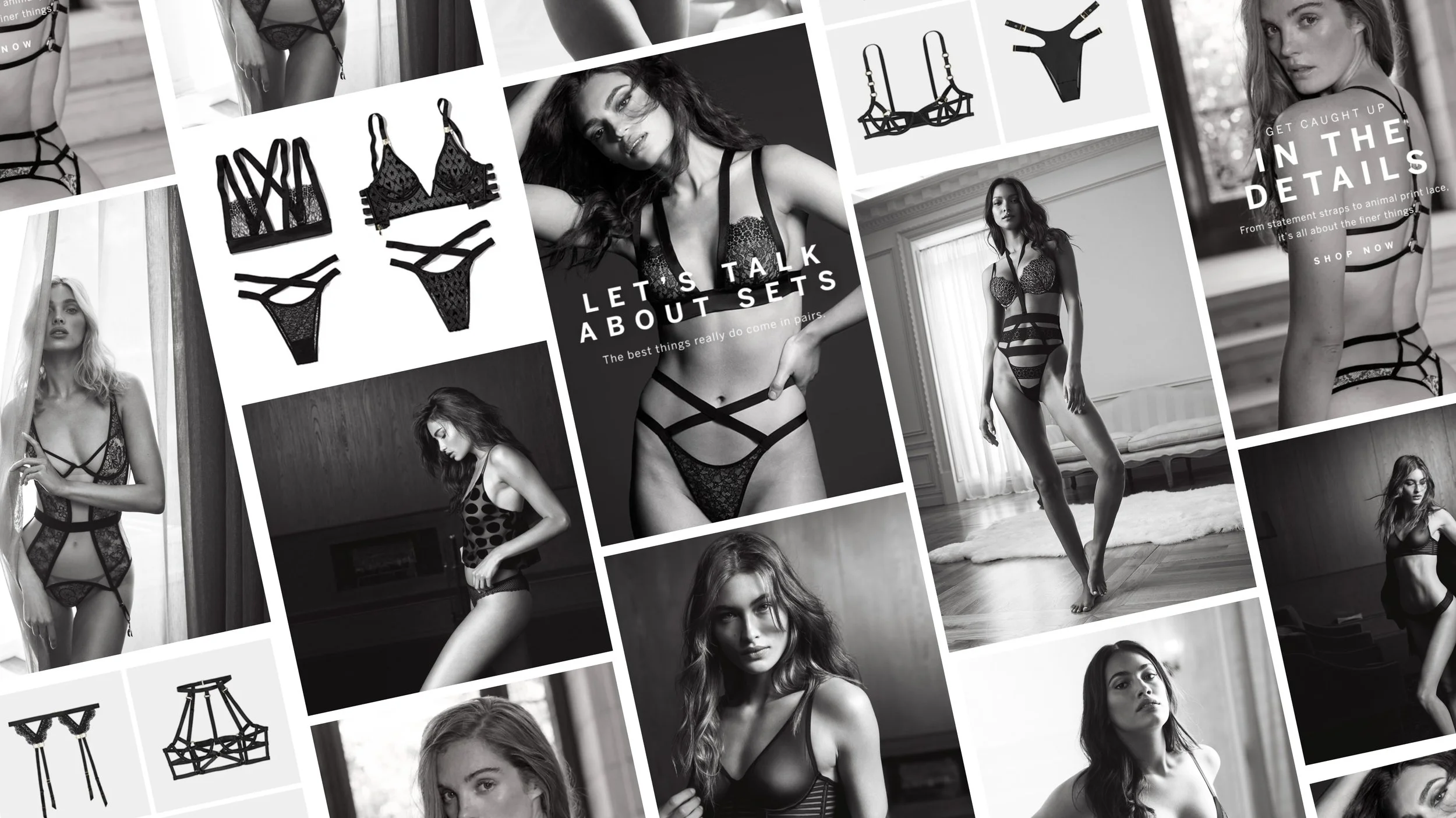
— Outcome
The redesigned experience brought a more cohesive and modern feel to Victoria’s Secret’s digital presence, aligning product exploration with the brand’s visual identity.
Key Results:
+58.73% increase in user engagement and transactions
Increased time spent interacting with product content
Stronger connection between storytelling and purchase behavior

— Learnings
What I learned:
Storytelling is a powerful driver of conversion when integrated seamlessly into the shopping experience
Visual rhythm and layout can guide behavior without relying on heavy UI
The balance between inspiration and usability is where the strongest experiences live
When design feels intentional, it turns browsing into engagement.