Avon Web Redesign
Modernizing a timeless brand. A large-scale e-commerce redesign focused on clarity, conversion, and brand consistency.

-
UX/UI Desgn
E-commerce Experience Design
Creative Direction
Design Systems
Conversion Optimization
-
Avon Art Director & Copywriters
LG CNS Team
-
Figma
— Overview
Avon is a heritage beauty brand navigating the shift toward modern e-commerce expectations. This project focused on refining Avon’s digital shopping experience - improving clarity, consistency, and conversion while preserving the brand’s legacy and trust with longtime customers.
— Challenge
The biggest challenge:
Modernize the experience without losing brand trust
Create consistency across a large and growing catalog
Improve usability without disrupting existing customer behavior
— Solution
Design that sells and tells a story.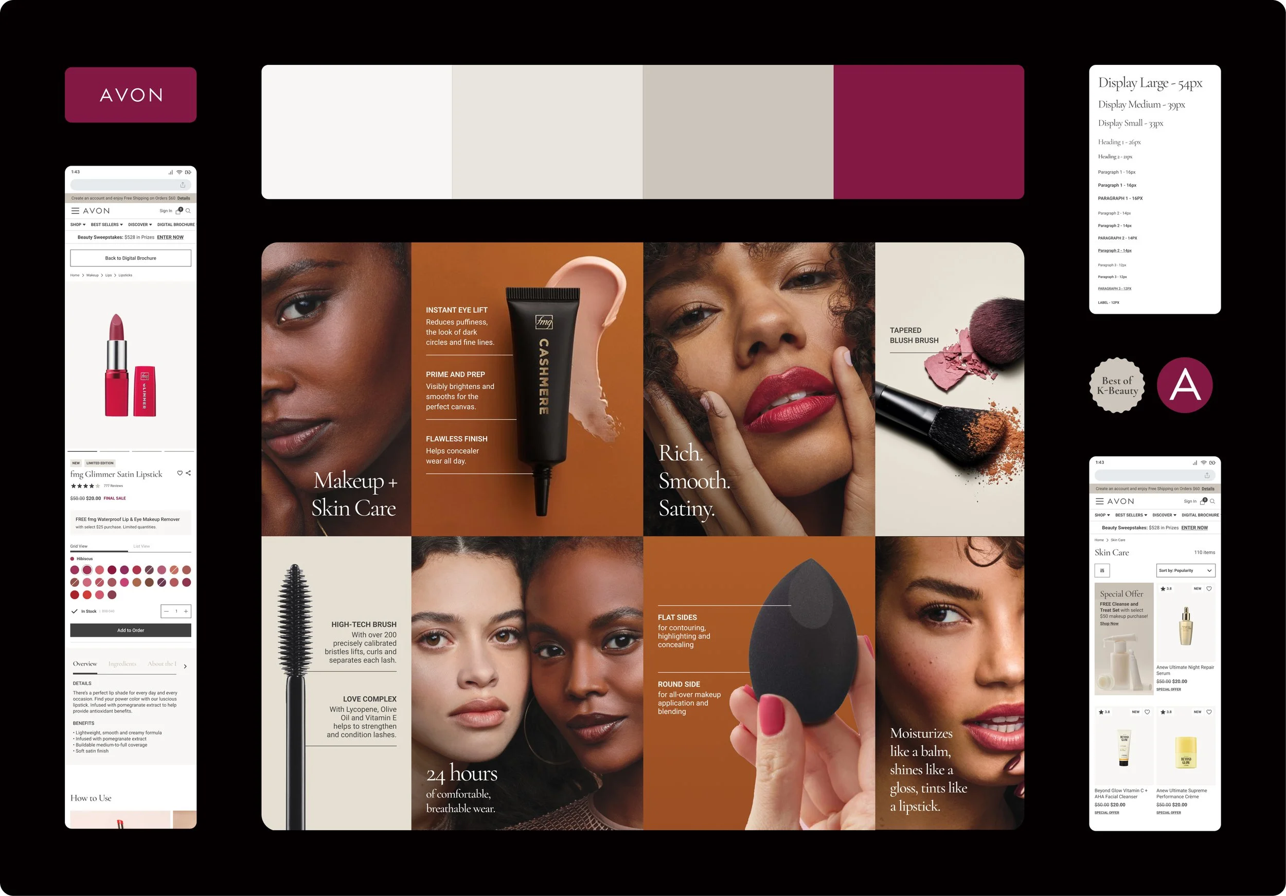
— Ideation & Design
My Approach:
I focused on evolving the experience without reinventing it - prioritizing clarity, hierarchy, and consistency across touchpoints.
Research & Insights:
Shoppers needed clearer product hierarchy
Visual inconsistency made browsing feel fragmented
Small UI changes had a big impact on confidence and flow
Design Exploration:
Explored layout, typography, and visual hierarchy to modernize the experience while staying true to Avon’s identity.

— Prototype & Design
Solutions that stuck:
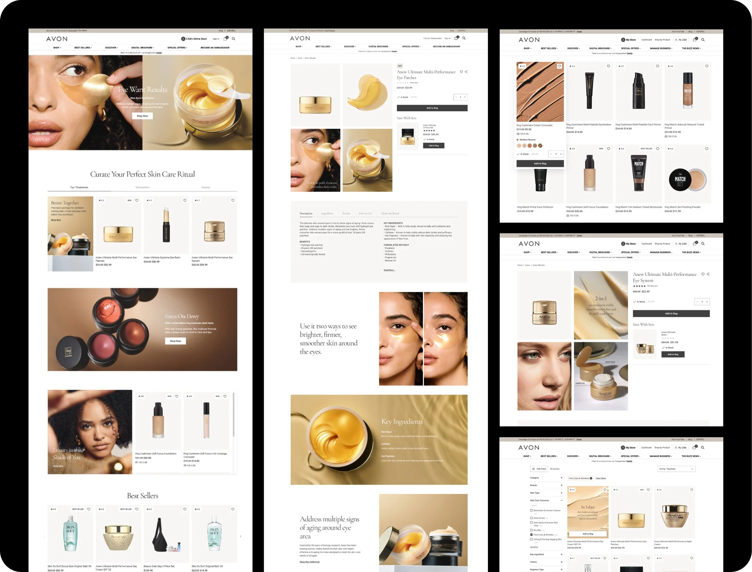
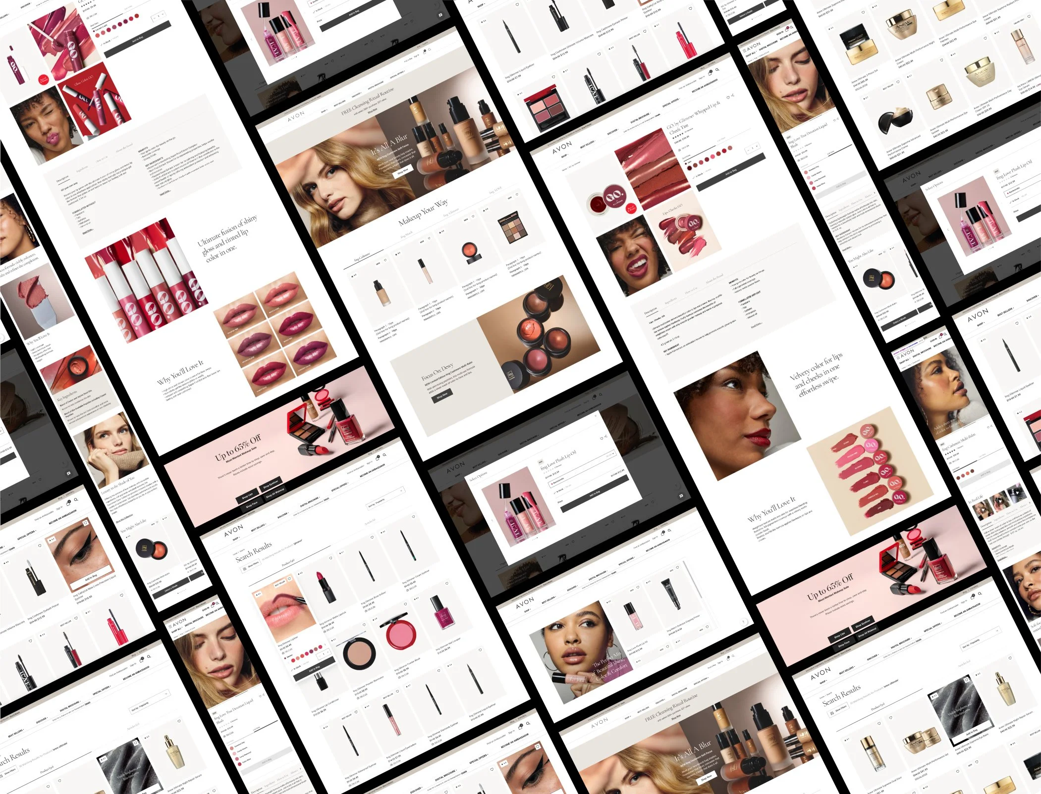
Cleaner product pages focused on key decisions
Improved hierarchy to guide scanning and comparison
Personalized sections to make users feel seen
Shade previews & subtle hover states to speed up decisions
Collaboration:
Worked closely with developers and cross-functional partners
Balanced brand vision with real production constraints
Iteration:
Refined layouts based on feedback and performance
Simplified flows to reduce friction and speed decisions
— Outcome
Outcome:
A refined e-commerce experience that improved clarity, consistency, and usability across Avon’s digital storefront.
Key Results:
4,000+ daily orders post-launch
+14% lift in campaign performance
+10% year-over-year growth contribution
491,341 new subscribers acquired
$4.5M+ revenue in 3.5 months
Scalable design system rolled out to site, newsletters, email campaigns, and skin analyzer tool

— Learnings
What I learned:
Constraints are creative fuel. Being tied to certain templates forced me to stretch design muscles I didn’t know I had.
Purpose is better than prettiness. Visuals matter, but helping real humans shop easily is the real win.
Collaboration makes the magic happen. The best ideas came from bouncing between developers, designers, copywriters and art directors.
This project reinforced that great e-commerce design isn’t about reinventing the brand, it’s about removing friction so the brand can do its job.