Arbo Technologies.
Revamping the onboarding experience of Arbo, the all-in-one financial solution website to simplify operations and reduce errors for startup owners.

-
UX/UI Design
-
4 Weeks
-
Figma
-
3 UX Designers: Atoro Lopez, Janice Connolley, and Lisa Oh

Overview.
-
Arbo's onboarding heavily relied on the COO's personal involvement, hindering scalability and operational efficiency.
-
Revamp the onboarding process with a seamless UX/UI redesign, aiming to streamline operations and reduce errors.
-
Within a 4-person design team, I led competitive research and crafted high-fidelity mock-ups throughout the 4-week Design Sprint as part of Springboard’s Industry Design Project.
Kickoff Distinction.
We prioritized a seamless user experience through the application of design thinking's five stages: Research, Define, Ideate, Prototype, and Test.
Project Scope.
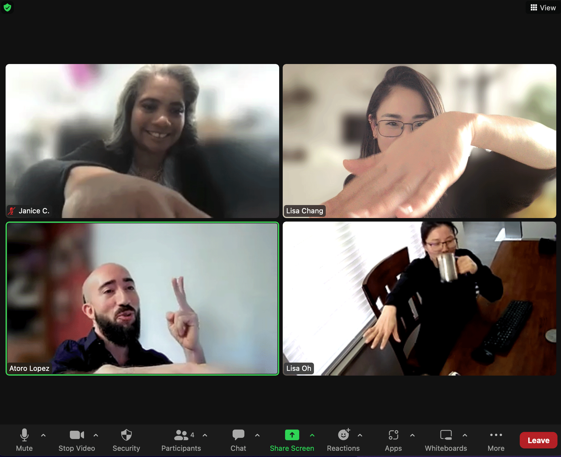
In collaboration with Atoro, Janice, and Lisa Oh (via remote meetings on Zoom), deliverables were defined as follows:
-
Research, User Flows, and Initial Concept
-
Low-Fidelity Wireframes
-
High-Fidelity Mock-Ups
-
Prototype and Test
Week 1
Week 1

Generative Research.
Launched in late 2021 in Georgia
Offers in-house remote consulting for small to midsize businesses
Focus on bookkeeping, tax, and analytics
Main users: local tech startups around Arbo's office
Aiming for a seamless foundation for data analytics to support growth
Committed to addressing user experience challenges for a smooth and hassle-free experience

Secondary Research.
Manual accounting is attractive to startups but prone to costly human errors.
Automatic backups prevent data loss during system failures.
Digital accounting solutions enhance accuracy, efficiency, and growth.

Competitive Research.
Bench: Welcoming brand, strong typography, clear information hierarchy.
Quickbooks: Effective use of copy and accent colors.
Finmark: Enjoyable user experience, balanced copy, and visuals.
These insights guided our design solution for a user-friendly experience.

Sign-Up Flow Analysis.
Arbo's competitors had more user-friendly and efficient sign-up processes, creating a warm atmosphere for a delightful first encounter.

Dashboard Screen Analysis.
During the evaluation of competitors’ dashboard screens, we observed the following key insights that informed our design decisions:
-
Our assessment revealed that Arbo's dashboard interface would greatly benefit from a UI design refresh. Enhancing the visual aesthetics and usability of the platform would significantly improve the overall user experience.
-
Upon arriving at Bench's dashboard page, we noticed the effective implementation of live messaging with bookkeepers. This feature was prominently positioned and easily accessible, enabling users to engage in real-time conversations for immediate support. Additionally, personalized pop-up messages with call-to-action buttons were strategically utilized to guide users and enhance their navigation experience.
-
One notable aspect of Quickbooks' dashboard was its comprehensive step-by-step approach. The platform excelled in assisting users by providing detailed guidance and highlighting prominent features along the way. This ensured that users could effectively leverage the platform's functionalities with ease and confidence.
-
Taking a step further in user guidance, Finmark stood out with its inclusion of step-by-step demo videos. These videos presented a clean, simple, and easily digestible design, facilitating users' understanding of complex processes. By leveraging visual demonstrations, Finmark successfully enhanced user onboarding and interaction.
User Flow and Initial Concept.
During the first week of our project, we dedicated our efforts to mapping out the user flow and carefully examining the existing design solution for areas that required improvement.
-
Improve how easy it is to use the platform and make sure it follows accessibility rules, so everyone using the product has a friendly and inclusive experience.
-
By finding ways to make things better early in the design process, we set the groundwork for a smoother and better solution. This way, it not only looks good to users but also follows the best ways of doing things in the industry.
-
Our commitment to delivering a design solution that excels in both usability and accessibility reflected our dedication to creating an outstanding user experience for our clients and their end-users alike.
-
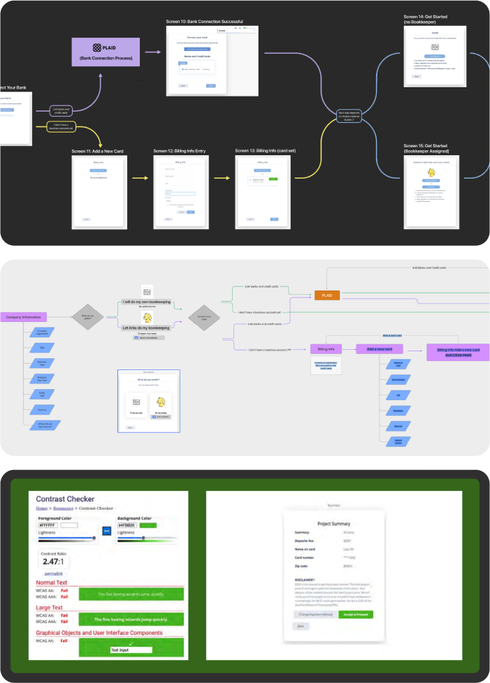
In our thorough analysis, we also discovered several instances where the current design fell short of meeting the necessary color contrast standards.
-
Recognizing the significance of this issue, we recognized the importance of addressing it in the final design.
Week 2
Week 2

User Testing.
In Week 2, we encountered a challenge when Riya was unavailable for a meeting. Despite this, and in our commitment to staying on schedule within our tight 4-week sprint, we decided to send a brief progress update via email instead of rescheduling.
Our team was determined to keep communication open with Arbo to ensure our final deliverables were precisely aligned with their needs at every step of the process.
Our team performed remote user testing and interviewed 5 small business owners.
They actively enrolled their businesses on the platform, allowing us to gain significant insights into the user experience.
This approach not only helped us uncover potential issues but also allowed us to identify user preferences.
These valuable findings played a crucial role in the development of our affinity map, providing a comprehensive understanding of user interactions and preferences, ultimately contributing to the refinement and enhancement of our design decisions.

Affinity Map.
Based on our findings, we identified key areas to focus on for the design effort. These include:
Enhancing navigation elements for better consistency and clarity (forward and back navigation, progress tracking, etc).
Adding clear conversational text guidance to explain the process and the purpose of certain elements.
Providing definitions for any uncommon terms to avoid confusion (e.g., FEIN, Cash Burn Rate).
Improving the initial impression when landing on the platform (the current form was confusing).
Simplifying the overall process.
Week 3
Week 3

Sketching Solutions.
During our Week 3 meeting with Riya, we had a productive discussion about the team's progress and plans.
We presented the key findings from our initial user interviews, highlighting consistent themes and areas for improvement.
To address these issues, we shared sketch solutions that aim to enhance the user experience.

Low-Fidelity Wireframes.
Moving on from the earlier stage, we transitioned to the wireframe stage to refine the solution.
-
Our primary aim was to craft simple, low-fidelity wireframes that captured the core of the solution without getting bogged down by intricate details.
-
This approach allowed us the flexibility to freely adjust and enhance our ideas without being constrained by overly complex designs.

Reexamining the Problem.
We showcased two potential revamped user flows.
In the first one, we made modifications to the existing flow, where users choose their account type and provide financial information.
The second flow, which is shorter, allows users to enter their company information and then directly explore the platform with a Free/DIY account. This way, they can get a glimpse of the platform's layout and capabilities before diving into the financial details.
Riya expressed a preference for the second version, and with that in mind, our team moved forward to develop the high-fidelity design.

Before and After.
I focused on analyzing Arbo's original sign-up page, carefully identifying areas that needed improvement. look and feel of the accounting platform with a fresh new look.
-
I crafted six redesigned options created with our team's goals and preferences in mind.
-
When it came to selecting a frontrunner, Option 1 emerged as the clear favorite among our team.
-
This choice set the course for our design aesthetics, as it became the driving force behind shaping the style guide and infusing the overall look and feel of the accounting platform with a fresh new look.

Final Visual Identity.
A minimal, lighter and leaner style guide was developed from Option 1:
-
Hues of light blues were designed to symbolize a smooth experience for business owners during sign-up, creating visual harmony at every step.
-
Font, style components, and colors were thoughtfully selected for a seamless and engaging experience.
-
Montserrat font, paired with black, dark blue, and dark gray colors were chosen to show a timeless and evergreen look throughout the website.
-
Orange, aligned with the existing logo, was chosen to highlight important elements like login prompts and asterisks, ensuring key information stands out.

High-Fidelity Prototype.
At this stage, we designed the key screens of our high-fidelity prototype, featuring elements like expandable menus, smooth scrolling, interactive highlights, and helpful tooltips.
To ensure a smooth user experience, we added a quick tour for a simple and inviting introduction before reaching the dashboard screen.
After refining the high-fidelity mock-ups, we conducted user testing to gather valuable feedback, understand user viewpoints, and address any initial issues for our high-fidelity mock-ups.
In our Week 3 meeting, both Arbo's CEO, Saurav Bhandari, and Riya expressed satisfaction with the redesign and progress so far, approving the next phase of final user testing.
Week 4
Week 4

Testing Results.
With our final designs and iterations in hand, it was time to put them to the test once again. We conducted interviews with 5 new users and received positive feedback, with only a few minor adjustments needed.
To streamline the user experience, we made the improvements below:
Displayed 'For Accountants' and the phone number.
Simplified entry fields to eliminate wasted space.
Displayed password requirements during signup or login.
Highlighted eye-catching orange brand color for emphasis.
Implemented a prominent, heavy blue Call to Action Button at the bottom.
These enhancements were well-received and helped to create a more user-friendly experience. With these final touches, we were ready to proceed to the handoff phase, confident in the positive impact our designs would have.
Improving Clarity and Usability.
Improvements greatly enhanced the user experience, making it more intuitive and visually appealing. We were excited to present these changes:
-
We eliminated the issue of white-on-white screens by introducing simple waves that create a contrast to help direct attention towards the welcome box and main information boxes, making them more noticeable.
-
We added an information button for FEIN (Federal Employer Identification Number), providing users with helpful details.
-
We also removed icons from the left-hand side of the Business Type section and alphabetized the types for easier navigation.
-
Additionally, we expanded the menu from 4 rows to 9 rows, accommodating more options and improving usability.

Simplified Access and Highlighted Features.
We made accessing the dashboard platform easier by providing direct access, with a grayed-out background that indicates the user has arrived without any barriers.
To guide users, we added a few quick highlights:
We highlighted the process of connecting users to their accounts.
We emphasized that an upgrade is required for invoicing.
We drew attention to the importance of Chats and Docs for uploading information and asking questions.
To improve the visual experience, we eliminated white-on-white screens on all pages and added shading to the background, creating depth and making information boxes stand out.
We also implemented a larger scroll for smoother scrolling access.
For brand consistency, we continued to use the orange brand highlight color, ensuring important elements like arrows and dropdown items catch the user's attention.
These changes provided a more streamlined and engaging experience, ensuring that users could navigate the platform effortlessly and find key features without any confusion.


Final Meeting.
Both CEOs expressed their satisfaction with the final deliverable, noting that the redesign was "much cleaner" and made the onboarding process easier. As a team, we were pleased with the feedback received and felt confident in our handoff.
Try the prototype here!
Reflections.
A 4-week design sprint done remotely with 3 different designers required hustle in an agile environment and taking ownership as much as possible, especially around project management. Though challenging, it proved to be a valuable learning experience. 3 key takeaways were:
-
Collaboration is essential for success.
-
Focus on delivering high-quality work, especially when limited with time.
-
Streamline processes and ruthlessly prioritize tasks.